What Sheila's seen this week: Developing a VIS strategy and plan

My weekly updates have become a bit thin on the ground recently, not because I haven’t been seeing lots of interesting things but mainly because I’ve been seeing and doing lots of “stuff ” at work and I haven’t really had the time to blog anything coherent.  My life just seems to be full of “stuff” that needs done.  Most of it is related in someway, but at times there is so much stuff around it’s hard to know where to start. However today is my VIS strategy planning day. But what is VIS? I hear you cry, dear reader.  Well, it’s my new favourite acronym – Very Important Stuff.

This morning my colleague Jim and I have been working with SD (stuff done)  methodology to develop our VIS plan.  Most of our most pressing “stuff” relates to our upgrade of VLE (GCULearn)  which will happen in late July.  Early this week we spent a really informative day with colleagues from Blackboard going through the changes in the April 2014 release. I had seen the main highlights at the #bbtlc2014 conference last month, but it was great to get some more time to go through them in more detail.  Some of the new things will be great (particularly the student preview) but we are also now planning to do a few other things like using LTI and integrating some more third party services which we haven’t done before.  We’re looking to trial MyKnowledgeMap with some of our student nurses when they are on placement and possibly WebPA too.

Anyway, as I have now have quite a long to do list, I best get back to that. I’ll be blogging more about some of the actions from our VIS plan as and when they happen.


VIS Diary Appointment

Challenges of web residency case study – our vistor and residents journey and case study #HEAVandR

We have now officially completed our HEA Challenges of Web Residency Project, and submitted our case study on Friday.

This post is really just a collection of what we have shared so far and a link  to a draft version of the case study we submitted to the HEA on Friday.  Things didn’t go quite as planned, particularly around getting student engagement, however we are still working with the V&R model, and in fact did a workshop with some undergraduate students yesterday afternoon.  The case study explains in more detail our experiences and reflections of the project, as ever I’d be interested in your thoughts/experiences.


Sheila's V&R map, Feb 2014
Sheila’s V&R map, Feb 2014
visual workshop notes
workshop notes
Picutre of blank v&R map with biscuits and sweets
Essential kit for v&r mapping


All dashboards but no (meaningful) data – more on our #learninganalytics journey

Back in March I blogged about the start of our journey here at GCU into learning analytics. We had just produced our annual blended learning report which had some headline stats around learning and teaching activity. As I said in the post, the figures we are getting are not that accurate and extracting and making sense of the data from numerous sources has been no mean feat for those involved.  Since then we have been making good progress in moving things forward internally so this post is really an update on where we are.

When I was working on the Cetis Analytics Series, I remember Jean Mutton, University of Derby, telling me about the power of “data driven conversations”.  I have a far greater understanding of exactly what she meant by that.  Since instigating  initial discussions about the where, what, why, when, who and how of our data we’ve been having some really productive discussions, mainly with our IS department and most importantly with one of our Business Analysts, Ken Fraser, who is now my new BFF 🙂

Ken has totally risen to our data challenge and has been exploring our data sets and sprinkling a bit of BI magic over things. Like many institutions, we populate our VLE automagically via our student record system. It is a key source of data and really our primary data source for student information. However actual student activity is recorded in other systems, primarily our VLE. We haven’t quite cracked the automagic feedback of assessments from the VLE back into our SRS – but again I don’t think we’re alone there. So any meaningful analytics process(es) needs to draw on both of these data sources (as well as a number of other ones but that’s for another post).

We also take a snapshot of our VLE activity every night, which Ken has been churning into a datastore, which has been quickly filling up and seeing what he can extract.  Using Oracle BI systems he has been able to develop a number of dashboards far quicker than I expected. But, and there’s always a but, they are next to meaningless as the data we are extracting in our snapshot is pretty meaningless e.g we can get total number of users, but it looks like the total number of users we’ve had on the system since it was installed. It is also not a real time process. That’s not a huge issue just now, but we know we have the tools to allow real time reporting and ideally that’s what we are aiming for.

So we are now exploring the tables in our snapshot from the VLE to see if we can get a more useful data extraction. and thinking about how/if we can normalise the data, and make more robust connections to/from our primary data source the student record system. This is also raising a number of wider issues about our data/information management process. The cycle of data driven conversations is well and truly in motion.

In terms of learning analytics we are really at the exploratory meso stage just now.  We are also getting lots of support from Bb too which is very encouraging.  It may well be that using their system will be the most useful and cost effective solution in the long run in terms of learning analytics. However I don’t think we can make that decision until we really understand ourselves what data we have access to, what we can do with it given our resources, and what we want to do with it. Then I can get back to ranting about big data and thinking about the really important stuff like just what is learning analytics anyway?

Are we just all data end points?

I’ve had  two very contrasting data experiences this week which are both clarify and confusing my views on data and learning analytics.  Firstly there was the LACE (learning analytics community exchange) project webinar titled: Big Picture of Learning Analytics Interoperability. Brian Kelly has written up the event and his blog post contains a link to the recording.

If you think about it, interoperability is key to any kind of data and analytical work. However as the webinar explained, learning analytics has the added complication of the numerous levels and models it can work in and across. The project are very keen to engage stakeholders around concepts but I think they are suffering from the classic chicken and egg scenario just now. They want to engage with the community, but some of the abstract terms do make it difficult for the community (and I include myself here) to engage with, so they need real examples. However I’m not sure right now how I can engage with these large concepts. But in my next post where I’ll update on the work we;re doing here at GCU it might become clearer. I am very keen to be part/track this community so I guess I need to try harder to engage with the higher level concepts.

Anyway, as you’ll know, dear reader, I have been experimenting with visual note taking so used the webinar yesterday to do just that. It’s an interesting experience as it does make you listen in a different way. Asking questions is also kind of hard when you are trying to capture the wider conversation. This is my view naive of the webinar.

Visual notes from LACE webinar

In contrast, the University of Edinburgh’s “Digital Scholarship Day of Ideas : Data” had a line up of speakers looking at data in quite a different way.  Luckily for me, and others, the event was live streamed and the recording will be available over the next few days on the website.  Also Nicola Osborne was in attendance and live blogging – well worth a read whilst waiting for the videos to be uploaded.

A common theme for most of the speakers was exploration of the assumption that data is neutral.  Being a digital humanities conference that’s hardly surprising, but there were key message coming through that I wish every wannabe and self proclaimed “big data guru”, could be exposed to and take head of. Data isn’t neutral, and just because you put “big” it front of it doesn’t change that.  It is always filtered and not always in a good way. I loved how Annette Markham described how advertisers can use data to flatten and equalise human experience, and her point that not all human experiences can be reduced to data end points however much advertisers selling an increasingly homogenised, consumerist view of the world want it to be.

This resonated in particular with me as I continue to develop my thoughts around learning analytics. I don’t want to (or believe that you can) reduce learning to data end points that have a set of algorithms which can “fix” thing i.e. learner behaviour. But at the same time I do believe that we can make more use of the data we do collect to help us understand what is going on, what works, what doesn’t and allow us to ask more questions around our learning environments. And by that I mean a  holistic view of learning environment that the individual develops themselves as much as the physical and digital environments they find themselves in.  I don’t want a homogenised education system, but at the same time I want to believe that using data more effectively could allow our heterogeneity to flourish.  Or am I just kidding myself? I think I need to have a nice cup of tea and think about this more. In the meantime I’d love to hear any views you may have.


Where Sheila's been this week: The Challenges of Web Residencey workshop #HEAvandr

Earlier this week I went to London with my colleague Evelyn McElhinney to join the rest of the projects in the HEA Challenges of Web Residency Programme.  As I’ve written about before this programme is exploring  students use of online spaces using David Whites visitor and residents mapping methodology.

In terms of our project, we have only managed to run one workshop. There are various reasons for this, but mainly around timing, it took a bit longer to get ethics approval and then lots of our undergrad nurses were on placement when we planned our workshops.we are going to run some more between now and the summer.

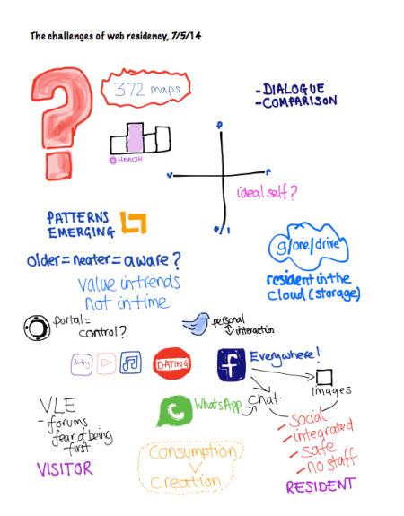
I was “well impressed” by some of the projects who have managed to get between 80-150 maps. It was also fascinating to see the overlay images David has managed to pull together. There were a few L shape patterns in the grid appearing. However, as David acknowledged it is hard to draw any concrete conclusions, and context is crucial.  So it was good to hear in a bit more detail from some of the projects about their experiences and conclusions.  Once common theme was that students did value their own online spaces for collaboration and didn’t want “us” there.

Once again I’ve been experimenting with visual note taking on my ipad and here is my note of the feedback session (clicking on the picture will take you to original image).

visual workshop notes
workshop notes

In terms of our experience, our participants were Post Registered Health Care professionals, so they are working full time and attending uni.  Unsurprisingly the are pretty strategic in the visitor and resident engagement. They have also found ways to circumvent professional barriers (e.g. quite closed networked systems)  that prevent them accessing what they find as useful services such youtube. We’ll be writing up our case study over the next fews days so I’ll be able to share more then.

Me in doodle mode!

photo of my hand drawing on ipad
Me sketch noting

#BbTLC2014 Highlights

I’m a bit late in getting this post out, but as those of you who follow me on twitter will know, I was at the Blackboard Teaching and Learning Conference in Dublin last week.  It’s the first Bb conference I’ve been to and I have to say I found it really enjoyable.  It was great to meet finally meet in person  twitter buddies @sharonlflynn and @hopkinsdavid, and get to know some more of the Bb European community.

There does seem to be a genuine shift in emphasis from Blackboard towards developing more customer led and informed “solutions” in new releases of the system. The Bb staff are also being very supportive in terms of helping us (and others) investigate some of our more strategic issues around TEL. However it is sometimes the simple things that make the most difference, so like many others I gave a small cheer as we saw the long wanted (and needed) student preview capability.  Other changes that will make a big difference to users included dragging and dropping artefacts into portfolios, improved assessment and feedback capabilities such as easy set up multiple marker roles, anonymous submission handling and searching.  Unfortunately the much nicer interface showed in Jay Bhatt’s keynote is still “under development” but hopefully we’ll get that, and responsive design in the not too distant future. I’m also really thinking about templates and how we can revamp our installation over the summer as we move to the next upgrade.

Bb really do seem to be taking notice of there international market, and as Jay Bhatt put it, not be “a US company that happens to sell in other countries”. Still not sure if “countrification” is a word, or a very good way of describing this 🙂

Inspired by the fabulous sketchnotes from David Hopkins, I’ve also started to play around with more visual note taking (well it’s actually more like quite bad handwriting and some doodles on my ipad). So here is the visual view of my highlights from the conference.


Image

Thinking about the almost now, some visual notes from #BbTLC2014

I’ve been fascinated by visual recordings of meetings for a while now. Once again I’ve been inspired by David Hopkins who I met for the first time last week at #BbTLC2014.  David has recently started to develop his sketch noting skills ( you can see his live notes from the conference over on his blog).

Over the past few years, my own note taking skills have really become  twitter-fied (not sure if that is a word). If I am at a conference I tend to tweet and that provides the basis for my note (and memory) of most events. In fact I think that the 140 limit in twitter has helped my synthesis skills. However, there is something about a picture . . . So  following  a chat with David on his experiences to date, I’ve decided to give it a go. I’ve ordered the sketchnote handbook and whilst  wait for that to arrive, I’ve been having a play with the notability app on my ipad.

I realise that my first attempts are a long way of what David and other such as Guilia Forsythe can do and I  have had a few days to think about things (doing things in the almost now!) But I just thought I’d share them.

So here are my very basic, slightly more visual notes from Professor Stephen Heppell’s and Jay Bhatt’s  (CEO, Blackboard) keynotes (click on the pics to see larger versions).   I think I might try and see if I can do a bit more visual note-taking and a bit less tweeting at conferences, and more practice of my drawing doodling skills.

Stephen and David’s approval has been  lovely and encouraging too.

css.php